 Isaac Bythewood
My day used to be the same handful of tabs over and over. Yahoo Finance for the indexes, Hacker News, the weather, and then a couple of my own sites to make sure they were still answering. None of it takes long on its own but I was doing it four or five times a day out of habit, and none of those pages are built for a ten second look anyway. Yahoo especially would rather show me an article about what the market is going to do next than the four numbers I came for.
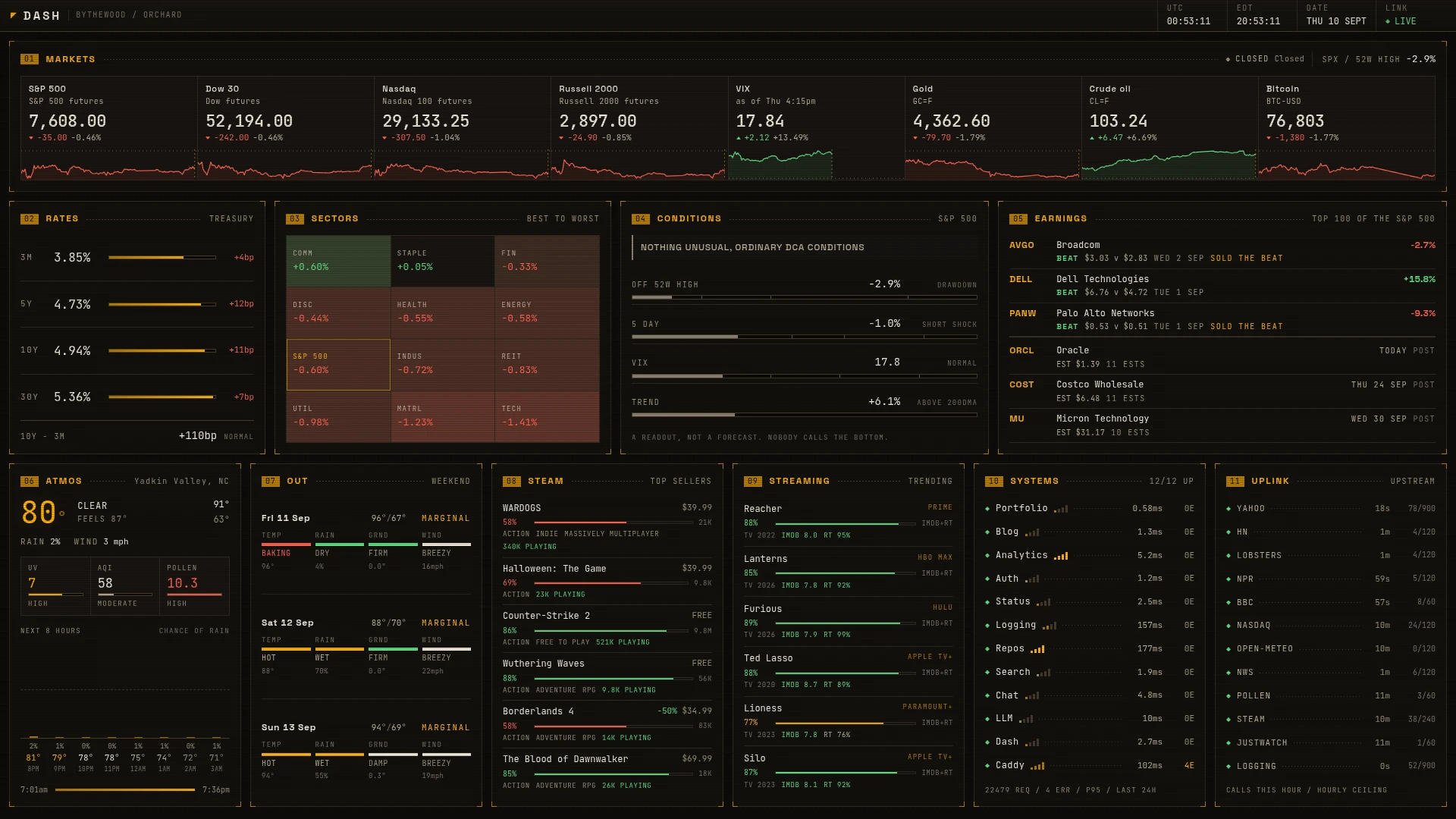
So I made my own and put it at https://dash.bythewood.me/. One page, no login, and it updates itself while you're looking at it. It's my new tab page now and it sits on my second monitor most of the day, which is about the same reason I made my own new tab extension back in 2022.
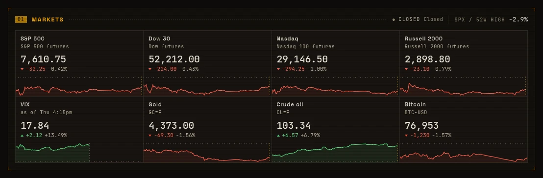
The markets strip is the part I look at most. Eight cards with the price in white and only the move coloured, since colouring both makes all eight of them shout at you at once. The sparklines run against the New York trading day. That puts the left edge of every card at 9:30 and the right edge on the same hour across all eight. Outside the session the four cash indexes swap themselves out for futures, and gold, crude and bitcoin never stop so those are always live.
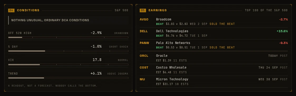
Under that are treasury yields, a sector heat map, and the earnings coming up and the ones that just landed. There's also a panel called conditions, which is the only one with an opinion in it. I dollar cost average and I buy into declines, so it only ever describes how far the market has fallen and it says nothing at all about selling, which I'd probably get wrong anyway. There's a test that fails if one of its headlines ever contains BUY or SELL or NOW IS. I wouldn't ship that to a general audience but it's how I think about it and it's my dashboard, so in it goes.
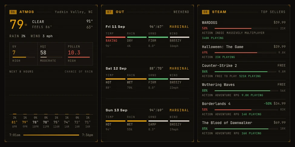
The rest is whatever I felt like having on there. The weather with the next eight hours of rain chance, a weekend panel that tells me whether it's worth being outside, Steam's top sellers, and one for what's trending to watch with the IMDb score and the tomatometer averaged onto a single bar.
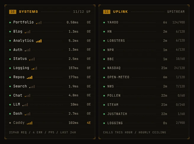
Then the health of every other site I run with its 95th percentile response time, and next to that a count of the calls I've made to each upstream this hour against a ceiling I picked myself. All of this runs on free keyless APIs and I didn't want to be the guy hammering somebody's endpoint. Nothing has tripped a breaker so far and Yahoo sits at around 12% of what I allow myself.
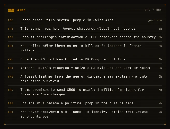
Then the news, ten headlines from NPR and the BBC newest first, deduplicated since the two of them word the same story differently. The front pages of Hacker News and Lobsters sit beside it.
It also looks the way I want it to look. Warm near black instead of pure black, amber for the labels and the corner brackets, and JetBrains Mono for every number. Every texture on the page is a CSS gradient so none of it costs a request, and the whole thing ends up looking something like an eighties instrument panel. You're never going to get that off a hosted dashboard, and you definitely can't turn the scanlines down on one when the first pass comes back looking like a screensaver!
The surprising part was how little work it was. It's Go with no third party dependencies at all and no database, and one poller per source pushes out to every open tab over server sent events, so ten open tabs still cost one request upstream. But I didn't sit down and write most of that. I said what I wanted and then spent a few evenings looking at what came back and complaining about it. The sparklines are wrong, the weather panel looks goofy, this text is too small to read, move the news feeds into a row of their own. That's the loop now. Ten years ago this is the kind of project I'd have scoped out on a notepad, felt great about, and never started. I'd have ended up on whatever dashboard somebody else hosts, with their panels and their idea of what I care about, probably with a subscription attached.
And I change it whenever I feel like it. Panels have been added, renumbered, rewritten and deleted. I asked for one with my actual holdings on it and it got built and deployed that evening. Then I changed my mind within the hour, since the site is public, so it all came back out again, the fetches and the state it kept and the symbols themselves.
So if there's a set of pages you're opening every day out of habit it's probably worth an evening or two to build the one page you actually wanted. The source for mine is in orchard under sites/dash.bythewood.me if you want to see how any of it is wired up.